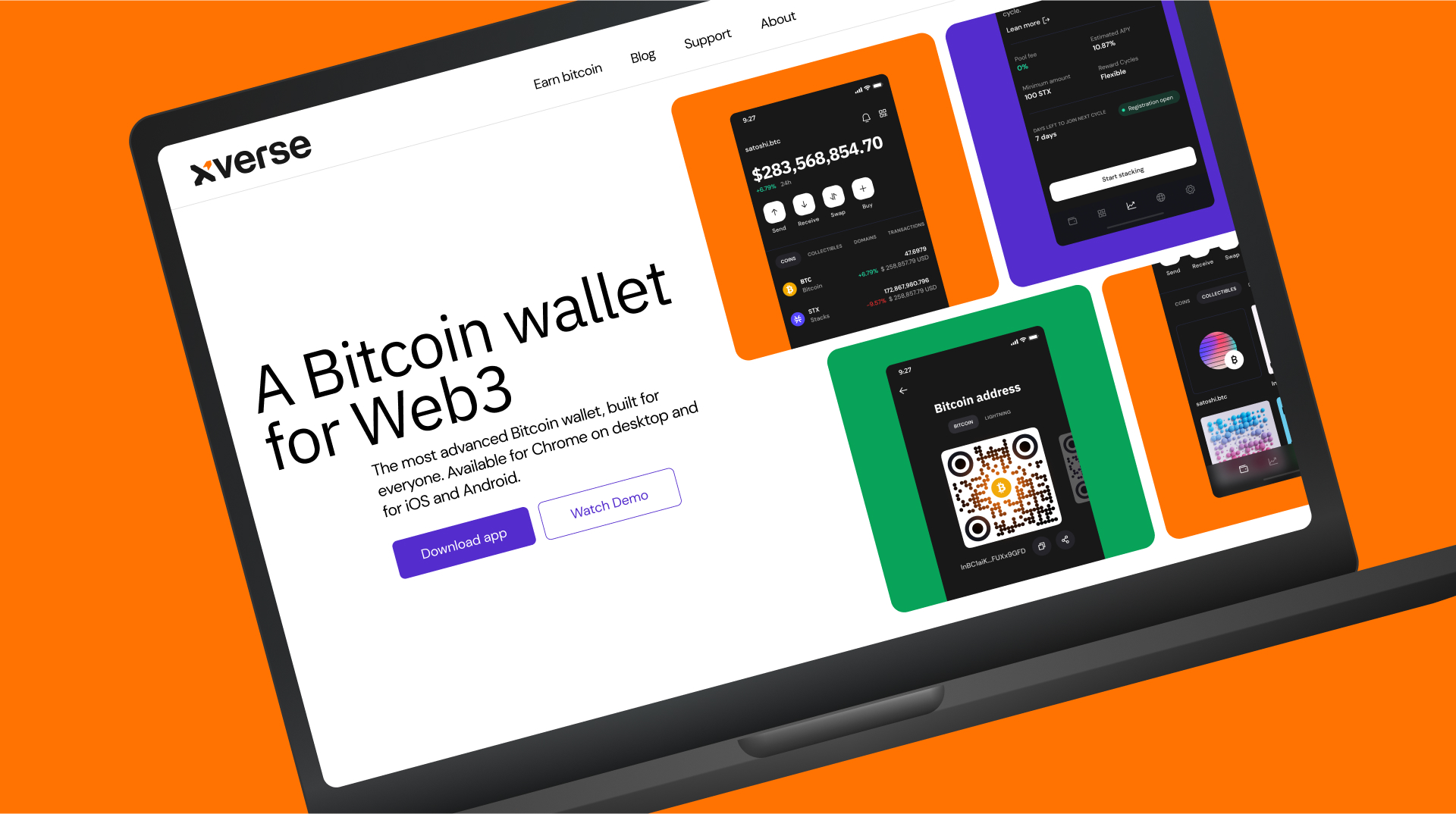
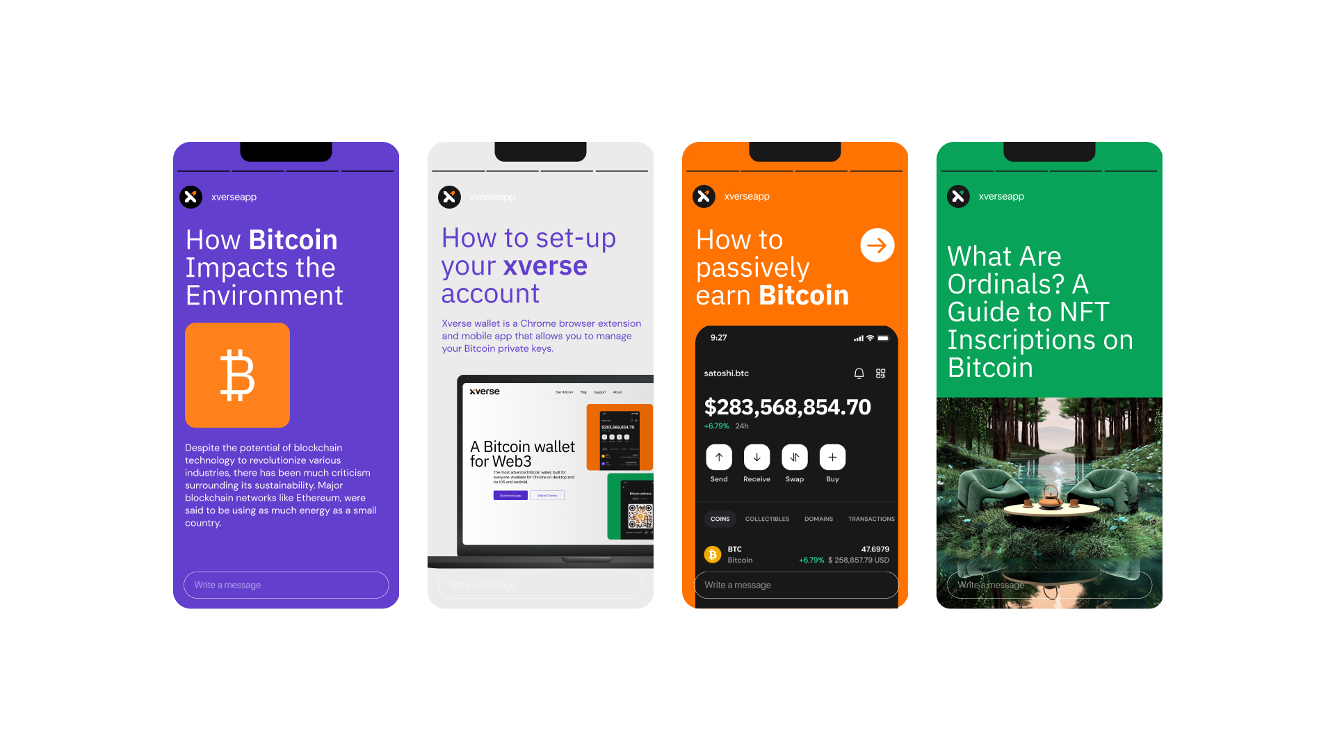
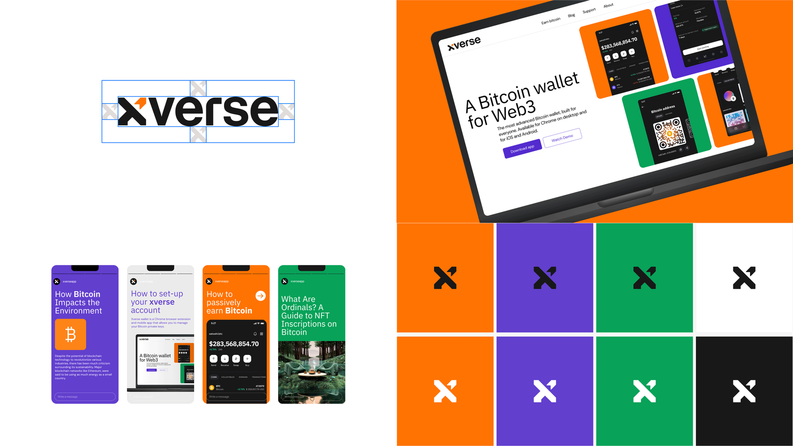
Xverse is building the world’s most advanced and user-friendly Bitcoin Web3 wallet. Xverse empowers individuals across the world to access the true potential of Bitcoin for Ordinals, NFTs, DeFi and Decentralized Applications by delivering a beautifully designed, easy-to-use wallet.
The logo features the bold Neue Haas Grotesk Display font — a powerful and elegant typeface reminiscent of Helvetica. We’ve made it even more captivating by adding a pronounced rounded angle to the “r” and softening the edges for enhanced visual appeal.
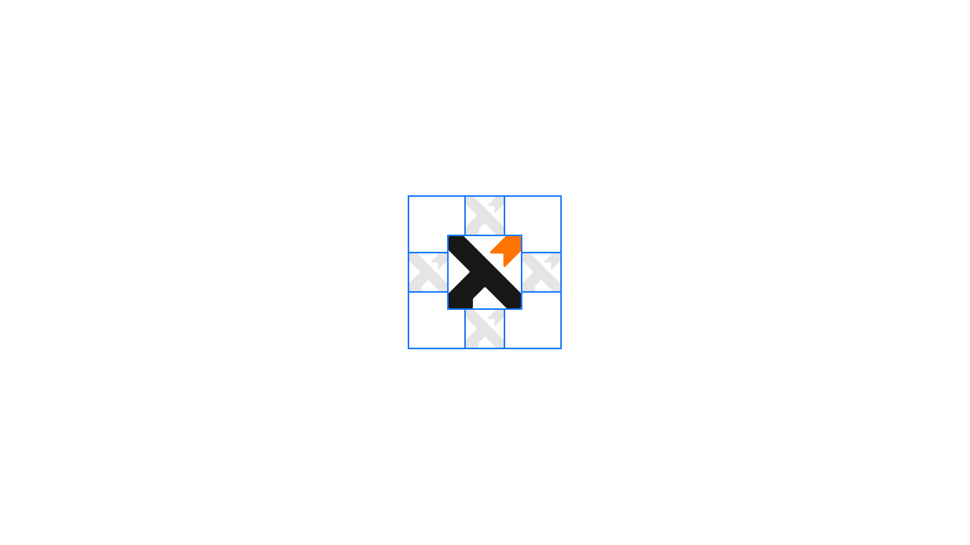
For the icon, we played with the base of the letter “x” by deconstructing its form. To enhance the symbol’s meaning, we have added a minimal arrow pointing upwards on one of its stems. This arrow represents the financial sector, and a graph with a positive exponent, effectively capturing the essence of Xverse while maintaining a modern and minimalist design aesthetic.


