Gen Z is projected to take the lead over millennials’ purchasing power by 2031. Brands can no longer afford to ignore young consumers. Now, while some brands have been making an effort to keep up with youth culture on a day-to-day basis, many have found themselves scrambling to regroup and rebrand to be able to target a demographic they had long obliviated from their sales funnel. The key to a thriving future? A fresh rebranding strategy.
So what is it that brands do in order to rejuvenate their luxury branding? What do the latest rebranding efforts of labels look like and are they working?
What does rebranding mean?
Let’s start with the basics: Rebranding refers to the process through which companies change their look and feel so as to be perceived differently by the consumer. More often than not it involves the rethinking of one’s marketing strategy as means of revitalizing the brand and making it relevant for contemporary audiences. A rebranding strategy may entail anything from a logo rebrand, a different slogan, a shift in visual identity, ethos, product, and sometimes even industry.
We are currently witnessing a clear rebranding trend, particularly as far as luxury fashion branding is concerned. With the tide of Gen Z’s influence coming in strong, many fashion labels are taking steps to win this demographic over. Or at the very least, position themselves in their field of vision.
Why are brands changing their logos?
If you’ve been paying attention over the past few years, you might have noticed that many brands have changed their logos and fonts and/or colour palettes. By now you might have guessed that it’s quite a common move in rebranding, along with changes in the name even. A logo rebrand is probably one of the most important steps when it comes to a rebranding strategy.
A brand’s visual identity is what first draws the consumer’s eye to it. If your goal is to be perceived differently, then surely changing the first thing audiences see, or at the very least the icon they should associate with you the most is a no-brainer.
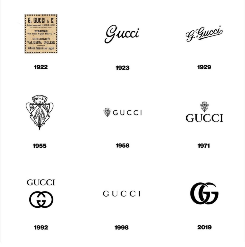
The evolution of branding can be seen by looking at the changes in visual identity

While these changes obviously have a lot to do with keeping up with the trends of the times, it’s also a fantastic way to issue in a new era. Take Gucci for example; Every time the figurehead of Gucci’s creative direction changed – from Tom Ford to Frida Gianinni, to Alessandro Michele – all packaging, labels, and store designs were reconfigured to match the vision of the new Creative Director. The result is one can draw a timeline of Gucci’s history simply by looking at its products during that time, and appreciating the evolution of the brand in its varying chapters.
Examples of brands who recently did a logo rebrand: All Hail Sans Serif
Hugo Boss recently changed its logo. Mind you it had remained unchanged since the label’s inception in 1924. That was until the rebranding of the century took place. A rebranding strategy that is looking to gain over millennials’ trust and wallets with Boss, and Gen Z’s with Hugo. Hugo Boss is one of the countless brands that have fallen for the charms of the sans serif font for their logo. Why? Well, it’s uncomplicated, younger, and more approachable. Precisely the qualities that young consumers are attracted to. It seems that long gone are the days when luxury fashion branding centred around exclusionary ideas. Quite an evolution of branding.

Some brands are even changing their names in an effort to drop any pretentiousness that might be associated with them. Salvatore Ferragamo for instance is now simply Ferragamo, and the brand’s logo has also joined the sans serif fan club. Ferragamo’s new logo is now simpler, and bolder, aimed at a generation that gets things done in a practical manner.
Burberry is yet another brand that jumped on the sans-serif train. Balenciaga too, as well as Berluti and Balmain. Yves Saint Laurent dropped its first name and switched to sans serif too.
Is changing a logo enough for a rebranding strategy?
No. Not at all. Many other elements should also be considered in a rebranding strategy. But the logo rebrand is perhaps one of the most noticeable changes or at least one of the ones that get the most attention. Still, if you really want your rebranding strategy to work you need to invest in it, you need to truly commit. A logo change won’t fool anybody unless there’s substance to the rebrand.
In the case of sans serif for example, sure, it’s a font that seems young, approachable, simple, and transparent. What you see is what you get. And even though this is precisely what brands what younger generations to see when they look at them, unless the rest of their action, both in marketing and production, match this attitude, they will have changed their logo in vain.
So… Does changing the logo work in high end branding?
Yes, it does. However, as we mentioned, it’s not the only element that has to undergo a makeover for a rebranding strategy to be successful. A change in the logo has to come hand in hand with a consistent and identifiable transformation of the brand’s identity.


